
NEXD
VISION
PROJECT DESCRIPTION
This was my first professional contract. I was tasked with originating the UI for a brand new CRM platform and was a one man design team.
This intelligent software advises sales associates, so that they can maximize closing rates. It also shows managers who is "killing it" and how they are doing so, then shares the wisdom with others.
The product aims to be as effective at guiding actions in the sales process as a GPS is at getting you home; finding and considering contextual information so associates can focus on what matters most - closing.
CONFIDENTIALITY
This software is still in beta launch and in order to comply with my NDA I am only allowed to show a few key screens for comparison of what the product looked like before I became involved and my style guide suggestions.
RELATIONSHIPS AND METRICS
This screen shows the contacts a sales associate is communicating with and how much of their time is devoted to these various relationships. It enables both salesperson and manager to analyze how much time is being spent per account and enables them to make adjustments if necessary to optimize closing rates.
TEAM
CHALLENGES
UX contractor :
Beau Pesa
CO Founder :
James Davison
TIMELINE
-
Without any prior knowledge of CRM enterprise software, I had to create a new and compelling interface.
-
Being the only UX/UI designer on the team, self management and education was necessary.
-
They asked me to improve and expand existing brand guidelines; using the palette and graphic conventions create a new interface design.
-
Managed my own time and meeting schedule.
1.5 years total
TOOLS
Pen and paper, Sketch, Adobe Illustrator.
ACTIVITIES
Client management, remote work, independent time management, wire frame creation, high fidelity mock up creation, made style guide variants, branding suggestions.
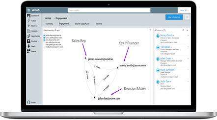
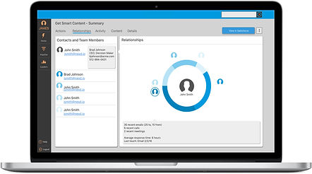
RELATIONSHIPS PAGE, BEFORE AND AFTER
This page is designed to show who a salesperson who is communicating and how much time was spent during each communication.
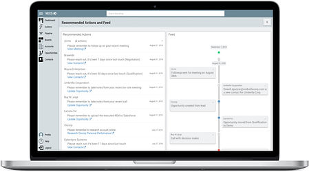
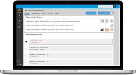
ACTIONS PAGE, BEFORE AND AFTER
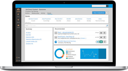
This page shows a list of recommended actions and denotes the severity of certain actions using different criteria, like time sensitivity for example.
ADMINISTRATOR PAGES, BEFORE AND AFTER
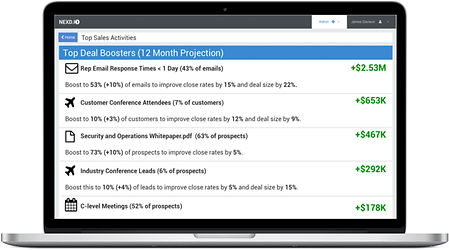
This page is for an administrator level user, it acts as a dashboard summarizing the different aspects of employee performance that they may wish to overview.
STYLE GUIDELINES AND COMPONENT LIBRARY
Using existing brand guidelines, I expanded our palette, tweaked the logo designed by Jeff Koke and built a component library from scratch. Syncing this document with InVision's inspect feature enabled our development team to pull assets from it at requisite sizes without altering original file specifications.
Prev.
Next

.jpg)